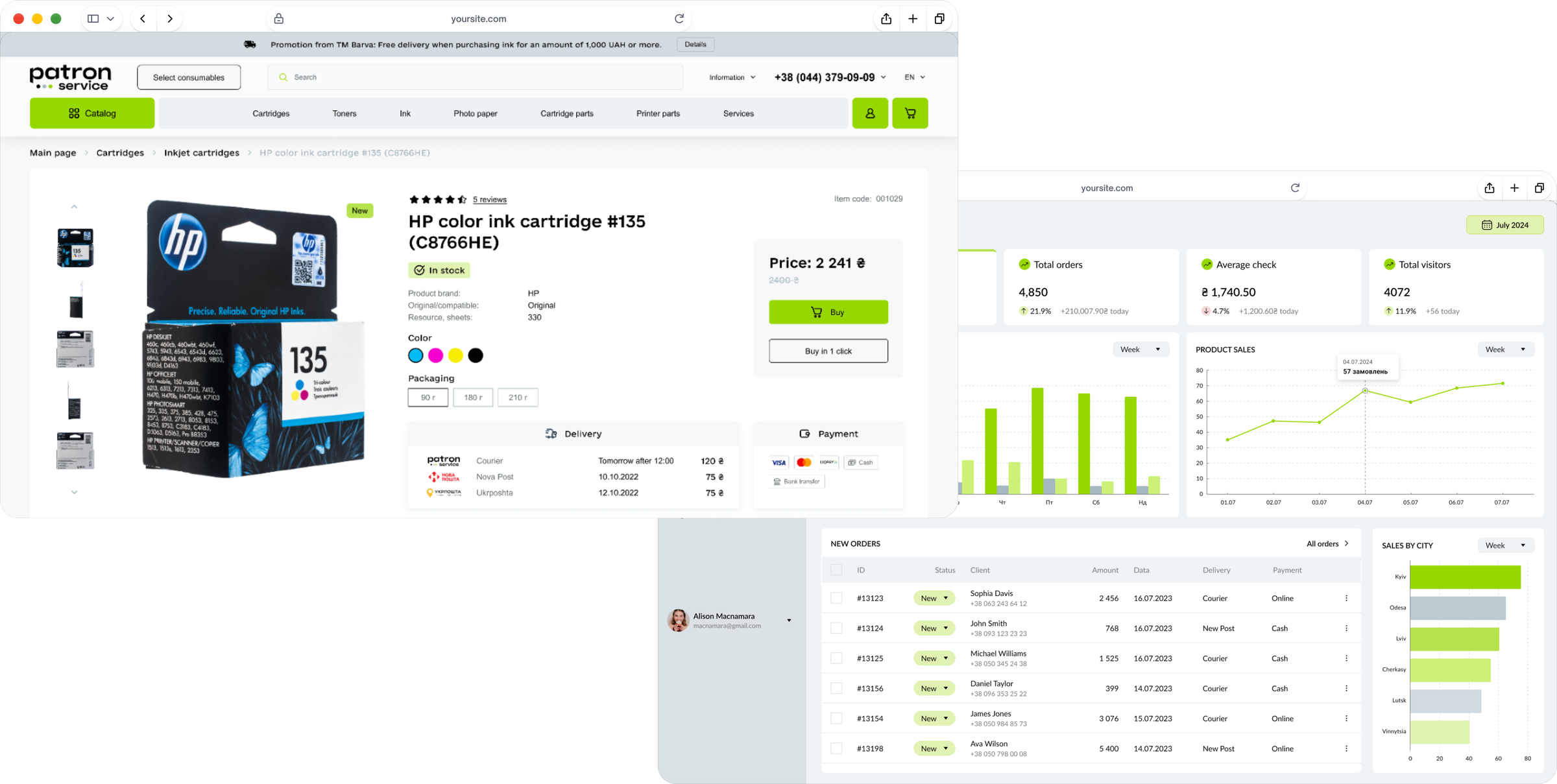
The storefront and the admin panel: two sides of one store.
Side 1 of 2
Storefront
The shop where people and companies find and buy their supplies. 2022–2025, web and mobile web.
Challenge
The store’s best service was hidden on its own site.
An outdated design on a custom-built platform: hard to update, support or extend.Search returned the wrong results.The store’s edge — the finder, a search for consumables that fit a specific printer or cartridge — was awkward to use, and many buyers aren’t technical.
Process
Listen first, then draw.
1
Research: the consumables finder was the best service — and the hardest to use
Before any screens I collected what the store, its customers and its competitors already knew.
Stakeholder interviews. Problems, goals and the client’s wishes; the client also collected feedback from regular customers about what they expect from the site.
Competitor analysis. Five Ukrainian stores — P.ua, Prote.ua, Doktor Toner, V-Print and Advanced Service: what sets each apart, what makes them strong — and which weaknesses and bugs to avoid.
Site map. A new structure for the store with the content blocks of every page, so search, the consumables finder and the account each got a clear place.
Key findingsMany buyers don’t know which cartridge fits their printerSearch returned the wrong resultsThe finder — consumables for a specific printer — was hard to find and to use
2
Design: the consumables finder comes first
The client wanted prototypes and design in one stage. So we planned the content blocks of every page already in the site map — and went from there straight to high-fidelity prototypes.
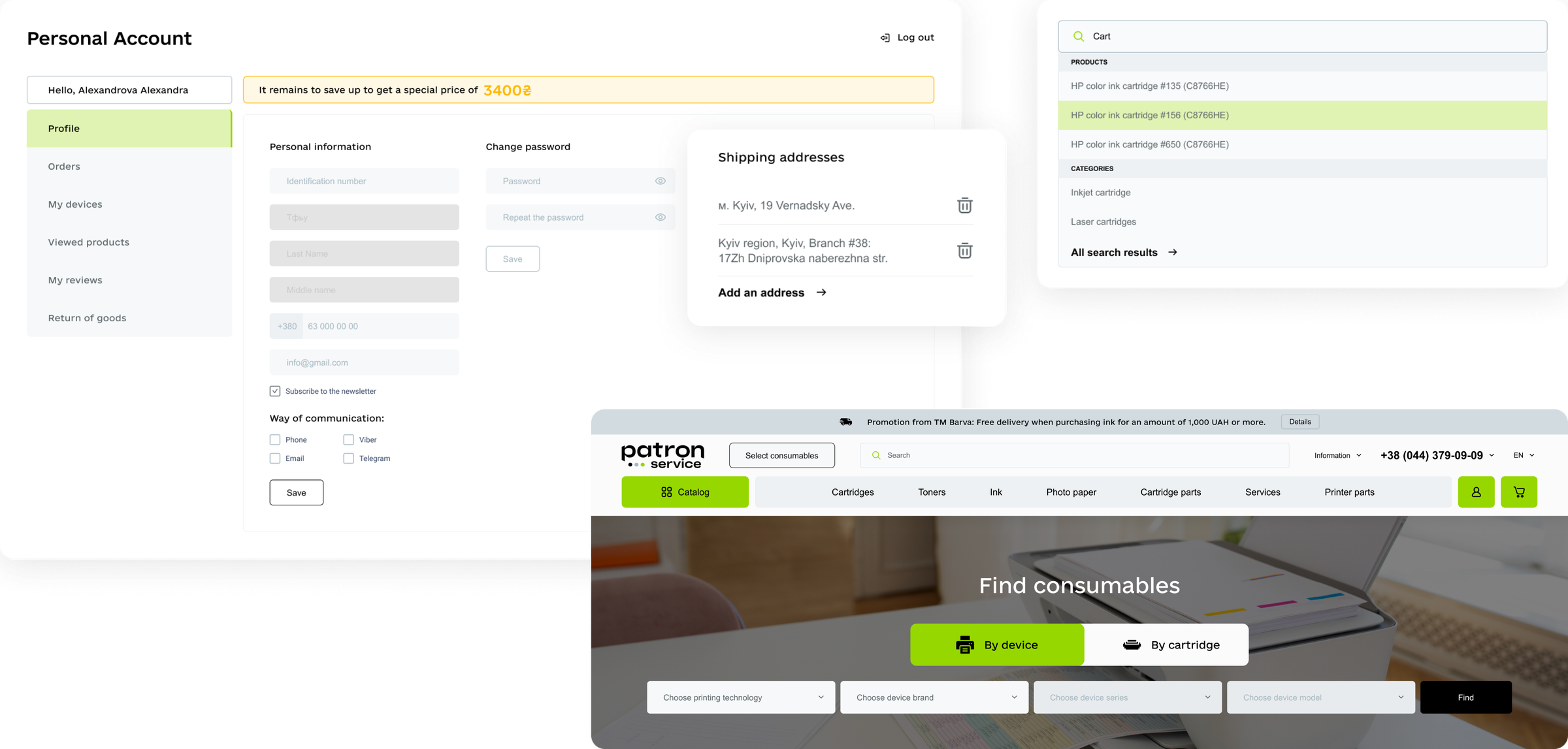
Finder on the home screen. Consumables for a specific device, with two ways in — by printer model or by cartridge — for buyers who aren’t technical.
Search and catalogue. Search by category, brand and product; a quick brand filter in the catalogue.
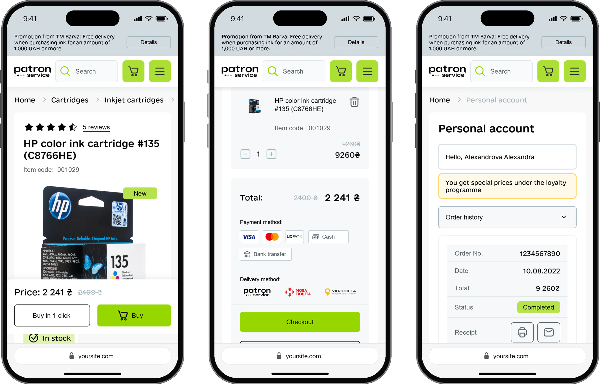
Product card. Options and every detail in one place, from payment to delivery.
Personal account. Adapted to people, companies and entrepreneurs: print or email a receipt, request a return, save addresses and printers.
The finder on the home page, search and the personal account.
On mobile: the product card, the cart and the order history.Prototype: finding a cartridge by printer on mobile, saving the printer, then reordering on the next visit.
Results
+10% conversion.
After the new features went live, storefront conversion grew by 10%, traffic began to grow and pages load faster. More visitors complete a purchase. Working through priorities with the PM meant the most critical tasks shipped first and saved the client time and budget.
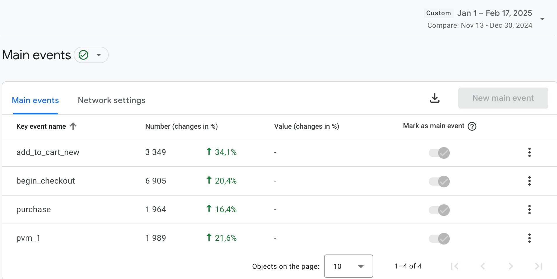
Key events: add to cart +34.1%, checkout +20.4%, purchases +16.4%.
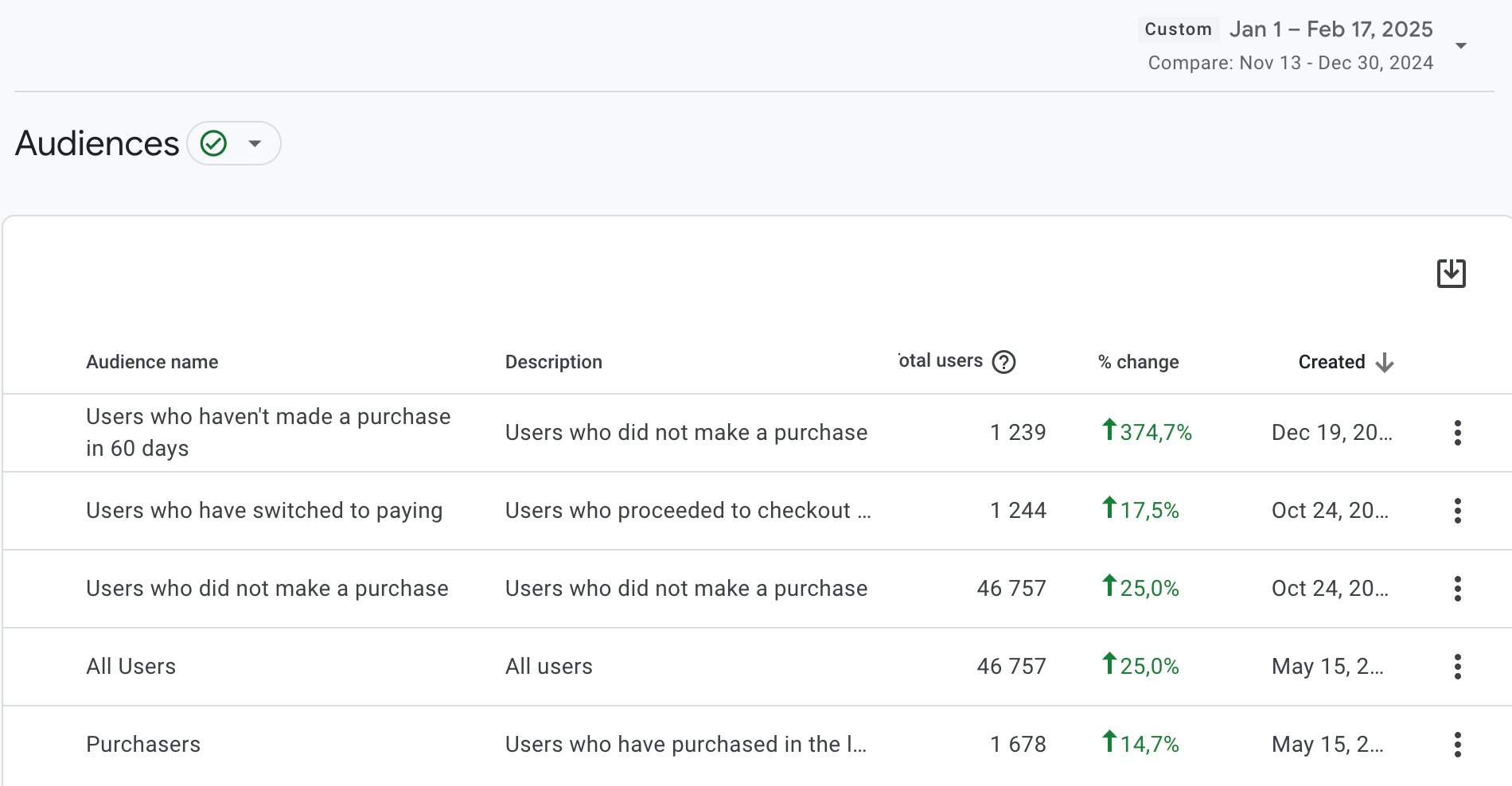
Audiences: all users +25%, purchasers +14.7%.
Google Analytics · Jan 1 – Feb 17, 2025 compared with Nov 13 – Dec 30, 2024
Next step
Does the SEO text hide the rest of the page?
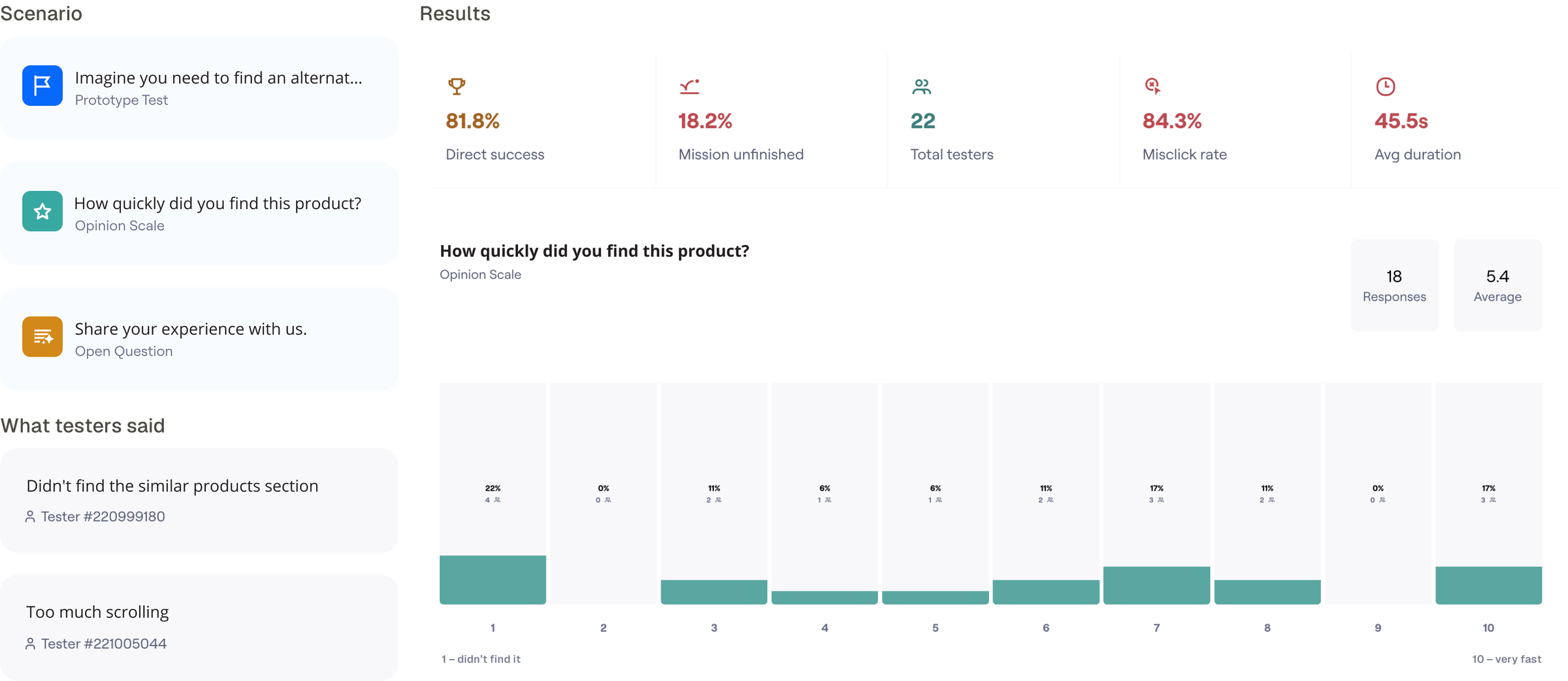
SEO specialists wanted the full product description visible — and sometimes it’s long. On mobile, where 38.4% of users shop, it could push the sections below out of sight and hurt conversion. I set up a Maze test: find the right section on the product page, with the next step agreed for every outcome.
PlanThey don’t scroll down → “Read more”, a section navigation, or the description at the bottomThey do → leave it as it is50/50 → build and test a section navigation
81.8% finished the task, but their ratings showed the right section wasn’t easy to find — so the description moves behind “Read more”, a section navigation or to the bottom of the page.
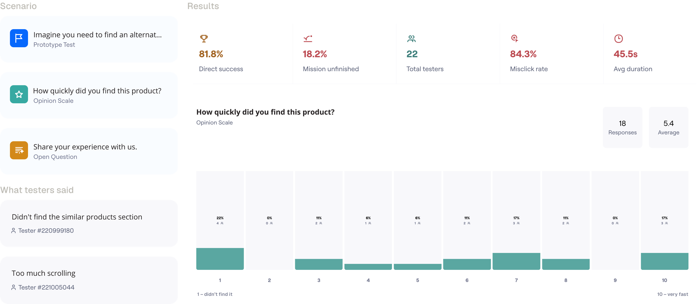
Maze: scenario, results and what testers said.
Side 2 of 2
Admin panel
The back office where the team runs 45,000+ products, orders and customers. 2024, web.
Challenge
Every routine task took too many clicks.
The client wanted a modern, intuitive admin for products, orders, users and analytics.Administrators needed too many clicks for core operations.The team had to work fast without drowning in information.
Process
Fewer clicks, less noise.
1
Research: what slows administrators down
I started with the people who use the admin every day.
Administrator interviews. Their pain points and requirements.
Competitor analysis. Existing admin solutions: what works, and where there’s room to do better.
2
Design: an admin in eight sections
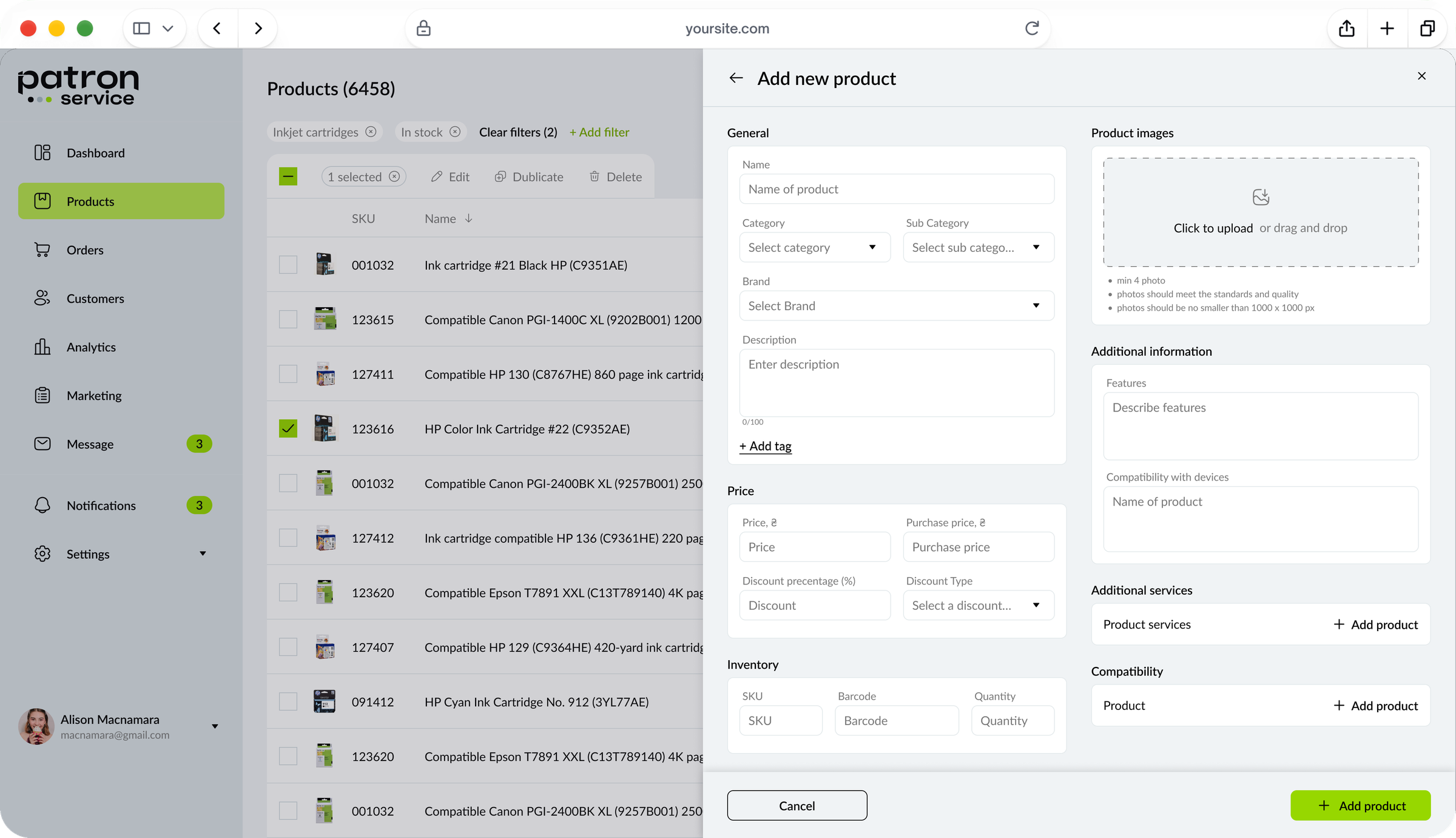
I built the structure around the core jobs — products, orders, users, analytics — and cut clicks from every key task. The main style came from the storefront, adjusted for what daily work in an admin panel needs: more data on screen, tables, filters and clear statuses.
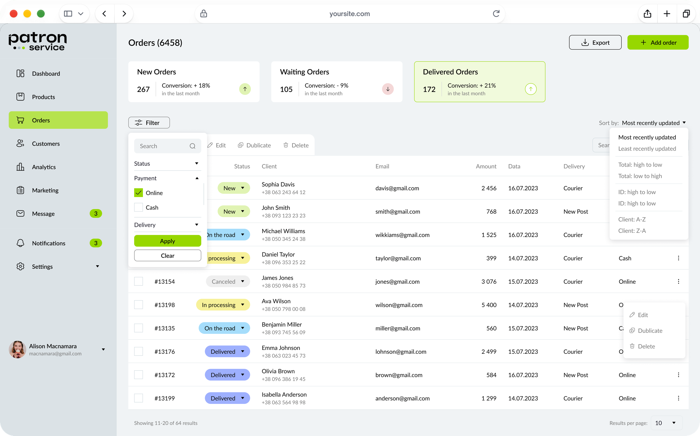
Filters and search everywhere, for quick access to the right record.
Contextual hints and quick actions: routine tasks in a few clicks.
A calm interface. Colour that doesn’t distract but highlights what matters; typography that stays readable on any screen.
ApproachWhen a feature got complex, I talked it through with developers before drawing: realistic options, fewer rebuilds, lower cost.
Admin: orders with filters and quick actions.
Admin: products and a new product form.
Results
−27% time on routine tasks.
With the new admin panel, administrators spend 27% less time on routine tasks. Clearer navigation and interface raised overall productivity and satisfaction with the system, and checking complex features with developers early cut unnecessary development costs.
How we measuredClicks and steps in key scenarios, counted before and after, and the difference turned into a percentage.